I Really Hate Transistor’s Interface
- Updated: 7th Jul, 2014

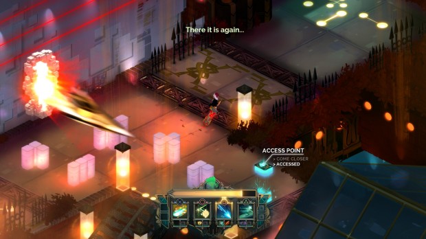
I do not get Transistor. It’s a lovely PS4 game which fabulous visuals, a soundtrack that perfectly complements its eerie atmosphere and a highly tactical combat system. But I simply cannot grok it.
The root of my problem comes from the interface design, which is simply awful. But first, I need to explain how the combat works.
You’ll spend most of the combat in a pause screen that allows you to queue up commands until you fill your Turn() bar. You choose your commands from an action bar at the bottom of the screen, which you configured from a menu before the battle. Once you’ve queued all your moves, hit the execute button and your character, named Red, will whizz about the battlefield performing the chosen functions. (They’re called functions because programming theme.) Most of your actions will be unavailable for a few seconds after this, leaving Red vulnerable as her Turn() cooldown resets.
I need to point out that a Turn() isn’t actually a turn in any normal gaming sense. This game uses real-time combat. Your Turn() is actually a series of high-speed actions. Think Quicksilver’s big scene in X-Men: Days of Future Past only without the sense of humour. Also not as overpowered because you can find yourself hitting air if your enemies move early in the Turn().
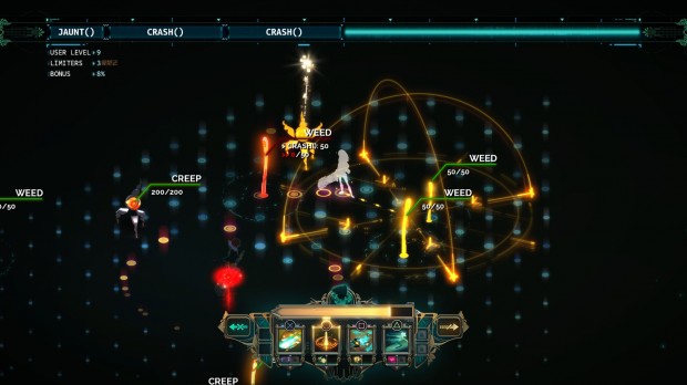
The combat interface itself is wonderful. A fantastic battle overlay that tells me everything I need to know about my enemies, my range, my limitations and the damage that I will cause. You can add or remove commands very easily, allowing you to try out plenty of combos before committing.
My problem lies entirely with the config menu and the action bar. Here’s the combat interface with the action bar at the bottom.
See those four big symbols at the bottom? What do they indicate? It’s impossible to tell because their icons convey hardly anything about their effects. Now how about the teeny tiny symbols below them? Those are basically a smear of colour, disconcertingly similar to the larger ones.
The large icons are your main attacks. In this setup they are, L-R:
Crash() – Does some damage and makes some enemies vulnerable to further attacks
Cull() – An extremely powerful upward strike.
Spark() – Throw some projectiles.
Jaunt() – Dash across the screen to a new location
Now Jaunt() is fine. Its icon conveys movement and your character, which is exactly what it does. The rest are pretty much meaningless when you don’t know what they are, except for Spark() which could be a single projectile bouncing around a map – and that happens to be precisely what an entirely different command will do. That one is called Bounce(). It’s also green and yellow and while they look different side-by-side, it’s not enough in a pinch.
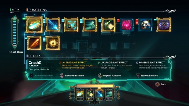
Here’s the menu that I really hate.
All the information you need is there. Somewhere. The functions are in no order that I can fathom, starting with Crash, then Breach, Spark, Jaunt, Bounce and so on. The green, blue or red blocks indicate the amount of memory that each will require, filling up the MEM bar on the left. They’re not ordered by type, damage dealt or, in fact, anything meaningful at all. I think it might be the order in which I unlocked them during the game.
You can’t actually see what each function does unless you select it first. Each one has different behaviour depending on whether you equip it in the action bar, in an upgrade slot or in a passive slot. That’s a hell of a lot of information to memorise and apply to those esoteric symbols.
Got 2 memory slots free? Scan back and forth across the entire list to find what fits. Want the function that causes large-scale damage in a single hit? Scan back and forth across the entire list to find the one that does this. Want to swap out some upgrade slots? Look at the teeny-tiny upgrade icon at the bottom of the action bar, scan back and forth to find the first function, hit Remove Installed and then scan back and forth again to find the new one.
It’s all awkward as hell and I’ve not even touched upon the Limiters, mostly because I still don’t quite get what they are. Limiters seem to be passive buffs, but different passive buffs to the passive buff slots that you can unlock to equip with these primary functions. You can access them by pressing L2 as it says on-screen but for some reason that prompt has been placed inside the box that describes a selected function even though they’re entirely independent from all the functions. Whyyyyyyy would you do this, Supergiant Games?
Even the icon colour palettes don’t provide any information. You might think that yellow indicates direct damage or blue indicates healing. Nope, they’re purely there to look pretty. The pink heart does indicate that you can charm an enemy to your side for a few seconds, which makes perfect sense and then they go and ruin everything by calling it Switch(), as if Switch() wasn’t already a clearly-defined programming term that has nothing to do with charm. Aaaargh.
Every time I try to play this game, I quit half an hour later, in frustration at this menu. It makes me angry just thinking about it.
Pretty game, though. Nice music.
Transistor is out now on PS4 and PC. It was developed by Supergiant Games, creators of Bastion.


Follow Us!